Blog
About musical structures in painting

An examination of Paul Klee's "Static-Dynamic Gradation"
22/10/2016
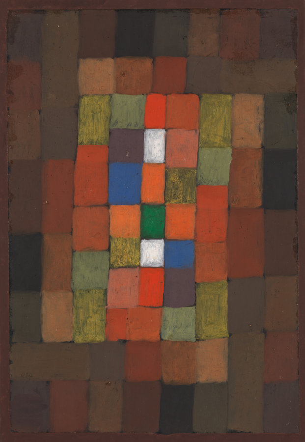
"Static-Dynamic Gradation" by Paul Klee, 1923
From about 1913 the Swiss-German artist Paul Klee was experimenting with abstract imagery. He was perhaps the most inventive painter in the whole of 20th century art, coming up with whole new categories of pictorial design. He did a number of paintings that were composed simply of squares and rectangles in grid-like arrangements. Many of his works are “semi” abstract; products of the imagination but featuring discernible objects, people or animals. But the square paintings are entirely abstract. They’re not pictures of any thing, but through clever manipulations of colour, texture and structure they succeed in evoking emotional responses.
Before becoming a painter Paul Klee was a gifted violinist, and he continued to play and perform for most of his life. He had a very sophisticated understanding of musical structures, and he translated these into visual forms.
This painting “Static-Dynamic Gradation” (1923) may appear at first sight to be a fairly random collection of coloured squares, a bit brighter in the middle, rather dark around the edges. But if you study it closely you will find a complex structure which he has, to some extent, tried to conceal from us. There’s a four-legged spiral of squares and rectangles starting in each corner. Each leg follows the same sequence of colours until they meet the four green rectangles at the corners of the inner region of brighter, more saturated colours. The four sides of that rectangle are each composed of small green and orange rectangles which almost have rotational symmetry but Klee disrupts the pattern a little, like musical variations. In the very middle - 3 squares wide by 5 squares high - the left and right hand columns have exact rotational symmetry: brown, blue, orange, green, pink. The central column of 5 squares: white, orange, green, white, red, breaks with the pattern but retains the colour theme. In musical terms this is the melody.
The key difference between visual compositions and musical ones (apart from the obvious) is one of time. Music is presented in a sequential way over a period of time, paintings are presented in one hit as complete objects. Of course, we can then examine them a bit at a time and take in all the details, but it’s still there in front of us as a complete composition. That can never happen with a piece of music. We can only ever hear it in sequence, moment by moment.
Klee doesn’t forget that he’s composing a visual experience, not an audible one. Instead of presenting the musical structure in a linear fashion, like sheet music, he has rolled it up into a sort of square Swiss roll with the jam in the middle (!). It is a painting, after all, and this makes it more compact, and more coherent as a visual structure. It does disguise the musical structure to some extent, but it enhances the visual appeal. The brightest (and perhaps most appealing) part - the “melody” - is in the middle and this area of greatest colour saturation and contrast advances spatially towards the viewer. The “bass” lines, the dark squares around the outside, recede, and so we have the illusion of depth.
What Klee never really does is use squares like pixels to create an image. There’s no picture to see here, only structure, order and harmony. Static, perhaps, around the edges and dynamic in the middle.
Digital imagery shows us how pictures can be made out of squares. Inspired by Klee’s paintings and the digital revolution, I put 2 and 2 together to make images out of pixels. Just as Klee’s “Static-Dynamic Gradation” is a painting and not a piece of music, so my paintings are paintings and not digital images. I get to make the rules and my rules are that the pixels can be any size I want, and they can overlap (digital pixels are all the same size and sit in a strict grid). Where there’s not much going on in the image the pixels can be large. Where there’s a lot of detail they tend to be small (and are allowed to disappear entirely). However the texture of the canvas tends to pick them up again if you look very closely at it. Around the edges the pixels often disperse altogether and there’s just canvas. I want to show how the picture is constructed - its mechanics. The contrast between the reality of raw linen and the realism of the image heightens our awareness of both. They pull our attention in different directions: one into the picture and the other back into the real world. This mirrors the way digital devices draw us into a “virtual” reality while we remain surrounded by the real world. The mechanics of digital imagery...
Comments (click to expand)